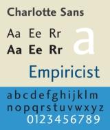
Charlotte Sans
Encyclopedia
Charlotte Sans is a humanist sans-serif
typeface designed by Michael Gills in 1992 as part of a larger family called Charlotte, which includes a related serif text face. The face was designed for Letraset
.
Charlotte Sans bears comparison with Eric Gill's 1927 face Gill Sans
sharing several humanist sans-serif characteristics: a double story roman a and g, and a single story lowercase italic a. Charlotte Sans has a tapered glyphic stroke in the t. Terminals in vertical strokes are not parallel with the baseline but instead cut at an angle. Similarities can be seen with Syntax
and FF Scala Sans
. The overall stroke width is varied and rhythmic is seen especially in the serif version of the face which was inspired by the types of eighteenth century punch-cutter Pierre-Simon Fournier.
Sans-serif
In typography, a sans-serif, sans serif or san serif typeface is one that does not have the small projecting features called "serifs" at the end of strokes. The term comes from the French word sans, meaning "without"....
typeface designed by Michael Gills in 1992 as part of a larger family called Charlotte, which includes a related serif text face. The face was designed for Letraset
Letraset
Letraset is a company based in the Kingsnorth Industrial Estate in Ashford, Kent, UK.It is known mainly for manufacturing sheets of artwork elements which can be transferred to artwork being prepared. The name Letraset was often used to refer generically to sheets of dry transferrable lettering of...
.
Charlotte Sans bears comparison with Eric Gill's 1927 face Gill Sans
Gill Sans
Gill Sans is a sans-serif typeface designed by Eric Gill.The original design appeared in 1926 when Douglas Cleverdon opened a bookshop in his home town of Bristol, where Eric Gill painted the fascia over the window in sans-serif capitals that would later be known as Gill Sans...
sharing several humanist sans-serif characteristics: a double story roman a and g, and a single story lowercase italic a. Charlotte Sans has a tapered glyphic stroke in the t. Terminals in vertical strokes are not parallel with the baseline but instead cut at an angle. Similarities can be seen with Syntax
Syntax (typeface)
The Syntax font families are designed by Hans Eduard Meier. Originally started with sans-serif fonts, it was expanded to include serif designs.-Syntax:...
and FF Scala Sans
FF Scala Sans
FF Scala Sans is a humanist sans-serif typeface designed in by Dutch designer Martin Majoor in 1993 for the Vredenburg Music Center in Utrecht, the Netherlands...
. The overall stroke width is varied and rhythmic is seen especially in the serif version of the face which was inspired by the types of eighteenth century punch-cutter Pierre-Simon Fournier.

