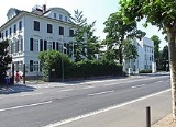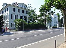
Museum für angewandte Kunst
Encyclopedia

Frankfurt
Frankfurt am Main , commonly known simply as Frankfurt, is the largest city in the German state of Hesse and the fifth-largest city in Germany, with a 2010 population of 688,249. The urban area had an estimated population of 2,300,000 in 2010...
, Germany
Germany
Germany , officially the Federal Republic of Germany , is a federal parliamentary republic in Europe. The country consists of 16 states while the capital and largest city is Berlin. Germany covers an area of 357,021 km2 and has a largely temperate seasonal climate...
and exhibits more than 30,000 objects representing European and Asian decorative arts. The new building of the museum was designed by the American architect Richard Meier
Richard Meier
Richard Meier is an American architect, whose rationalist buildings make prominent use of the color white.- Biography :Meier is Jewish and was born in Newark, New Jersey...
in the garden of Villa Metzler. The collection of furniture, glassware, and porcelain has expanded and includes now also product design and information design.
The building was designed as a craft museum, designed to house objects from the upper levels of the applied arts, distinguished from fine art only by having a utilitarian purpose. The general approach to the solution was taken form Louis Khan's precedent, the Yale Centre for British Art, where natural lighting was brought in through palazzo interior courtyards, illuminating non critical parts of the gallery. Meier based his concept on this, using side lighting (not top lighting like in the Clore Gallery) reflected into the exhibits off the bright white walls, so as not to cause damage from the ultraviolet rays (which are not reflected off the walls) , and the lighting becomes inhabited and part of the circulation. The whole building is about creating the feeling of the domestic interior. Meier set out not to make a house, but to create a domestic space; perceptually a series of smaller spaces that you encounter. The brief required this (small spaces).
Meier based the organisation grid and module on the cube like dimensions of the 19th century neoclassical palazzo and linked it by a second story bridge to the new building. A secondary grid parallels the angle of the nearby riverbank. The dynamic of these overlapping grids, rotated 3.5 degrees, creates a visceral sensation as the perspectives unfold. Pathways pass crosswise through the plan, bringing pedestrians and cyclists through the building and adjacent. The lighting becomes inhabited and part of the circulation. The plan geometrically allows the programme to be developed. The spaces are all practically the same size. The side lighting wall becomes part of the plan (trying to do the same job as the clore gallery roof). It has onion form-layers wrapped around characterising the plan. The spaces are not much bigger than domestic ones in existing the building. Ramps figure prominently in the plan, initiating a fixed procession that takes the visitor alternately through galleries and around green courtyards as the history of decorative arts is traversed-a circulation strategy that Meier returned to for the Getty Museum.
Meier creates interiors that look like they are side lit, but overcomes the problems of shadowing by the creation of diffused light via reflecting light off of bright white walls. Interior showcases are designed to look like walls. They are naturally lit and lit from the side, like houses (very few houses are top lit). Geometrically simple and act as reflectors, reducing sharp shadows and uniformity of light. Most of the exhibits are lit electronically using tungsten bulbs (tungsten bulbs are often found in domestic interiors). The whole building is about creating the feeling of the domestic interior.

