
Aqua (user interface)
Encyclopedia
Aqua is the GUI
and primary visual theme
of Apple Inc.'s Mac OS X
operating system
. It is based around the theme of water, as its name suggests, with droplet-like elements and liberal use of translucency and reflection effects. Steve Jobs noted Aqua's glossy aesthetic: "One of the design goals was when you saw it you wanted to lick it."
The Aqua theme and user interface was first introduced at the January 2000 Macworld Conference & Expo
in San Francisco. Aqua's first appearance in a commercial product was in the July 2000 release of iMovie 2
.
Aqua design elements make up the uniform appearance of most Mac OS X applications. Its goal is to "incorporate color, depth, translucence, and complex textures into a visually appealing interface" in Mac OS X applications. Although Aqua is the entire user interface, two notable features of Aqua are gel-like buttons (such as the ones colored red, yellow, and green that control the windows), and a Dock
, which facilitates the launching of and navigation between applications.
Aqua is the successor to Platinum
, which was used in Mac OS 8
and 9
.
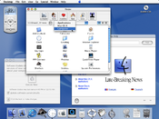 Much of Aqua's original design was intended to complement the translucent two-tone look of Apple's contemporaneous hardware, primarily the original bondi blue iMac
. In 2003 and 2004, Apple moved to the use of brushed metal
in their industrial design (such as with the aluminum Apple Cinema Display
s); in Mac OS X Panther
, Aqua changed accordingly, incorporating the additional brushed metal look while deemphasizing the pinstripe backgrounds and transparency effects. This somewhat inconsistent mix of interface styles has been controversial among the Mac OS X user community. Apple replaced these inconsistent window themes with the introduction of Mac OS X Leopard
. Starting with Leopard, the brushed metal look has been phased out, in favor of white inactive windows and gradient grey active windows.
brought with it flatter interface elements, such as new buttons and drop-down menus, as well as reducing the transparency to tone down the pinstripes in windows and menus. These trends would continue in further Mac OS X releases.
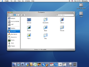
, brushed metal was fused to the heart of the Macintosh: the Finder. New buttons were made to appear sunken into their surroundings, following a general trend of more flattened interface elements in the operating system. The traditional pinstripes were replaced with a much subtler theme, most notably in the menu bar
, and the use of transparency was again reduced (for example in the title bars of inactive windows). Tabs
also changed; they were made flatter and the whole tab area was sunken rather than raised. Tab buttons were centered on the top border of the tab area. New icons appeared across the system, including a new flatter, glossier Finder icon and a new System Preferences icon.
brought more subtle changes, including the Unified titlebar scheme. Pinstripes were now removed from the menu bar entirely, replaced with a new glossy look. Tabs were altered to appear as normal segmented buttons. The Apple menu icon was toned down to a more matte appearance and the new Spotlight
search utility is permanently bound to the very right of the menu bar in the same color and gradient of the Apple menu.
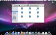
, several changes have been made to the user interface. The Dock
was made to look more three dimensional, with a reflective “floor” for icons to sit on and icon labels having a semi-transparent background. Active applications are no longer indicated by a black triangle, but now by a glowing blue dot. The dividing line between applications and other Dock items now resembles a pedestrian crossing
instead of a simple line. The dock is reflective of all elements on the screen except for the mouse cursor. “Stacks” are groups of files which can be stored in the Dock, and fan out when clicked.
The Dock
is black translucent with a white border and rounded corners when placed on the sides, but it retains a 2D
form of its new dividing line. The 2D form can also be applied to the default (bottom) Dock position with third-party tweaking utilities or by running a Terminal command to update a system configuration file.
The menu bar
at the top of the screen now has the option of being semi-transparent, a feature only available on Macs with a Core Image-capable graphics card installed (in non-upgraded specification this is all Intel Macs and PowerPC
G5s, as well as some later PowerPC
G4s). Contextual Menus are now all rounded (only slightly, like the corners of windows).
The drop shadow
of the active window
is now greatly enlarged for emphasis. Inactive windows are less prominent for greater contrast between active and inactive windows. Title bars are a darker shade of grey, and all toolbars now use a darker “Unified” scheme. Brushed metal
is no longer present, and has been replaced instead by a white “plastic” gradient scheme. Many windows now have minimal borders or none at all. Pinstripes in window backgrounds have now been completely removed. Sheets are now semi-transparent as well as blurring the area behind them for greater legibility.
Numerous icons have been changed, including a set of new folder icons, a new System Preferences icon and an updated Terminal icon, and all main icons have been redrawn in a high-resolution 512-by-512 size for sharper viewing in Quick Look
and Cover Flow.
The default background image has also been changed to a purple aurora
superimposed over a star
field instead of the previous aqua-blue themes in prior versions of OS X.
, many changes have taken place. The aqua scroll bars are traded for iOS-style ones. Push Buttons are square, similar to Mac OS 8 and 9, but still keep their Aqua look. Traffic light windows controls have been shrunk. Loading bars are no longer raised, and are flatter and sunken. The window background is slightly brighter. Round Textured buttons are transparent. Window corners have been rounded. And windows can now be in a "Full Screen" mode; on most applications found in Mac OS X, the window can take up the whole monitor space.
such as iTunes
, QuickTime
, and the Safari web browser
(although removed on Safari 4).
iTunes for Windows has followed the same theme as the Mac OS X version, with the exception of the use of native Windows user interface controls and Windows-style titlebar buttons at the upper right of the player window.
The Windows version of Safari, in version 3, included a functional Aqua look and feel (including pulsing scrollbar, sheets, and other interface similarities). As of version 4, a more Windows-like theme is employed using the standard Windows user interface controls and window border.
QuickTime for Windows uses the same theme as seen in older versions of QuickTime for Mac OS X, with Brushed Metal windows and Aqua buttons on top.
described the original Aqua scrollbar
s as "lickable globs of Crest Berrylicious Toothpaste Gel".
Mac OS X also allows users to choose a Graphite version instead of a Blue version of the interface. When using the Graphite scheme, controls appear grey rather than blue or multicolored. For example, the titlebar controls become three grey balls rather than traffic lights. This color scheme was added at the behest of developers and users who found the blue scheme to be too garish or unprofessional.
interface elements ('controls') and their NeXTSTEP
class name are given below. Most of the controls are available in three sizes: regular, small and mini.
Toolbars, defined as NSToolbar, are available in two types: standard or unified. Standard retains the normal Aqua title bar and simply places a row of icons below it, whilst the unified look extends the title bar downwards and places icons on top of it, as if the window has one large title bar.
Sheets, which are modal window
s, are also defined as NSWindow. When opened, they are thrust towards the user like a sheet of paper, hence the name. They are partially transparent and focus attention on the content of the sheet. The parent window's controls are disabled until the sheet is dismissed, but the user is able to continue work in other windows (including those in the same application) whilst the sheet is open.
 Menus are backed with a slightly translucent solid gray, and when menu items are highlighted they appear blue. In application
menus, which run in a single bar across the top of the screen, keyboard shortcuts appear to the right-hand side of the menu whilst the actual menu item is on the left.
Drop down menus for use in windows themselves (NSPopUpButton) are also available in several varieties. The standard "pop up" menu is white with a blue end cap with opposing arrows, whilst 'pull down' menus only have one downward facing arrow in the end cap. 'Pull down' menus are available in four different Aqua varieties, most of which have fallen into disuse with subsequent Mac OS X releases.
, and allows the user to drag non-editable 'tokens' to a text box, between which text can be typed. Whitespace before and after the tokens is trimmed.
Also available are rounded bevel buttons, designed to hold an icon; standard square buttons; glass square buttons and round buttons. In addition, circular, purple online help
buttons are available which display help relative to the current task when clicked. All types of button are classed as NSButton. Disclosure triangles, although technically buttons, allow views of controls to be shown and hidden to preserve space.
). Both are defined as NSProgressIndicator. The progress bar itself is available in two varieties: indeterminate, which simply shows diagonal blue and white stripes in animation with no measure of progress; or determinate, which shows a blue pulsing bar against a white background proportional to the percentage of a task completed. The spinning wheel indicator, also found in the Mac OS X startup screen, is simply a series of 12 increasingly darker grey lines arranged circularly, like the side view of a spoke
d wheel rotating clockwise. Many other interfaces have adopted this device, including the Firefox web browser and many web sites.
Mac OS X has a standard control for picking colors, NSColorWell, which appears as a regular square button with a color sample in the middle. When clicked, it shows the standard Mac OS X color palette.
Tab views (NSTabView) in Mac OS X appear to be sunken into the window, and are shaded darker and darker each time a new tab view is added inside another. The tabs appear in a row along the top of the sunken area, and are simply a series of white toggle buttons. The currently selected tab is blue. NSBox is a similar control, used to group interface elements, and uses the same sunken appearance, except without tabs. Image "wells" are also available (NSImageView), a small, sunken container into which image files can be dropped.
font as the standard system font in various sizes and weights. Some areas of the operating system such as editable text areas use another font, Helvetica
by default. Mac OS X makes use of system-wide font anti-aliasing
to make edges appear smoother.
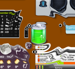 Aqua makes heavy use of animation
. Examples include:
Many of these effects can be turned off by the user or are only available on supporting hardware.
, the Mac OS X window server.
.
Despite accepting (for the most part) Apple's right to their copyrighted artwork, the skinning community took exception to their heavy-handed actions against all Aqua lookalikes; Stardock
's Brad Wardell
contrasted the company's litigious approach with Microsoft
's approach to incorporating third-party skins into Windows XP
.
Gui
Gui or guee is a generic term to refer to grilled dishes in Korean cuisine. These most commonly have meat or fish as their primary ingredient, but may in some cases also comprise grilled vegetables or other vegetarian ingredients. The term derives from the verb, "gupda" in Korean, which literally...
and primary visual theme
Theme (computing)
In computing, a theme is a preset package containing graphical appearance details, used to customize the look and feel of an operating system, widget set or window manager....
of Apple Inc.'s Mac OS X
Mac OS X
Mac OS X is a series of Unix-based operating systems and graphical user interfaces developed, marketed, and sold by Apple Inc. Since 2002, has been included with all new Macintosh computer systems...
operating system
Operating system
An operating system is a set of programs that manage computer hardware resources and provide common services for application software. The operating system is the most important type of system software in a computer system...
. It is based around the theme of water, as its name suggests, with droplet-like elements and liberal use of translucency and reflection effects. Steve Jobs noted Aqua's glossy aesthetic: "One of the design goals was when you saw it you wanted to lick it."
The Aqua theme and user interface was first introduced at the January 2000 Macworld Conference & Expo
Macworld Conference & Expo
Produced by Boston-based IDG World Expo, Macworld | iWorld is a trade-show with conference tracks dedicated to the Apple Macintosh platform. It is held annually in the United States, usually during the second week of January...
in San Francisco. Aqua's first appearance in a commercial product was in the July 2000 release of iMovie 2
IMovie
iMovie is a proprietary video editing software application which allows Mac, iPod Touch 4th generation, iPhone 4, iPhone 4S, and iPad 2 users to edit their own home movies. It was originally released by Apple in 1999 as a Mac OS 8 application bundled with the first FireWire-enabled consumer Apple...
.
Aqua design elements make up the uniform appearance of most Mac OS X applications. Its goal is to "incorporate color, depth, translucence, and complex textures into a visually appealing interface" in Mac OS X applications. Although Aqua is the entire user interface, two notable features of Aqua are gel-like buttons (such as the ones colored red, yellow, and green that control the windows), and a Dock
Dock (computing)
The Dock is a prominent feature of the graphical user interface of the Mac OS X operating system. It is used to launch applications and switch between running applications...
, which facilitates the launching of and navigation between applications.
Aqua is the successor to Platinum
Appearance Manager
In pre-Mac OS X versions of the Macintosh operating system, the Appearance Manager controlled the overall look of the Mac GUI widgets and supported several themes. The Appearance Manager was originally developed for Apple's failed Copland project, but with the cancellation of this project the...
, which was used in Mac OS 8
Mac OS 8
Mac OS 8 is an operating system that was released by Apple Computer on July 26, 1997. It represented the largest overhaul of the Mac OS since the release of System 7, some six years previously. It puts more emphasis on color than previous operating systems...
and 9
Mac OS 9
Mac OS 9 is the final major release of Apple's Mac OS before the launch of Mac OS X. Introduced on October 23, 1999, Apple positioned it as "The Best Internet Operating System Ever," highlighting Sherlock 2's Internet search capabilities, integration with Apple's free online services known as...
.
Evolution

IMac
The iMac is a range of all-in-one Macintosh desktop computers built by Apple. It has been the primary part of Apple's consumer desktop offerings since its introduction in 1998, and has evolved through five distinct forms....
. In 2003 and 2004, Apple moved to the use of brushed metal
Brushed metal (interface)
Brushed metal is a discontinued graphical user interface design used in Apple Computer's Mac OS X operating system for Macintosh computers. The first of Apple's applications to sport this look was the QuickTime Player released as part of QuickTime 4.0 in 1999.Apple's Human Interface Guidelines...
in their industrial design (such as with the aluminum Apple Cinema Display
Apple Cinema Display
The Apple Cinema Display was a line of flat panel computer monitors introduced in September 1999 by Apple Inc. It was initially sold alongside the older line of Studio Displays, but eventually replaced them. In July 2011, Apple replaced it with the Apple Thunderbolt Display...
s); in Mac OS X Panther
Mac OS X v10.3
Mac OS X Panther is the fourth major release of Mac OS X, Apple’s desktop and server operating system. It followed Mac OS X v10.2 "Jaguar" and preceded Mac OS X Tiger...
, Aqua changed accordingly, incorporating the additional brushed metal look while deemphasizing the pinstripe backgrounds and transparency effects. This somewhat inconsistent mix of interface styles has been controversial among the Mac OS X user community. Apple replaced these inconsistent window themes with the introduction of Mac OS X Leopard
Mac OS X v10.5
Mac OS X Leopard is the sixth major release of Mac OS X, Apple's desktop and server operating system for Macintosh computers. Leopard was released on 26 October 2007 as the successor of Tiger , and is available in two variants: a desktop version suitable for personal computers, and a...
. Starting with Leopard, the brushed metal look has been phased out, in favor of white inactive windows and gradient grey active windows.
Mac OS X 10.2 (Jaguar)
JaguarMac OS X v10.2
Mac OS X version 10.2 "Jaguar" is the third major release of Mac OS X, Apple's desktop and server operating system. It superseded Mac OS X v10.1 code name Puma and preceded Mac OS X Panther...
brought with it flatter interface elements, such as new buttons and drop-down menus, as well as reducing the transparency to tone down the pinstripes in windows and menus. These trends would continue in further Mac OS X releases.

Mac OS X 10.3 (Panther)
In Mac OS X PantherMac OS X v10.3
Mac OS X Panther is the fourth major release of Mac OS X, Apple’s desktop and server operating system. It followed Mac OS X v10.2 "Jaguar" and preceded Mac OS X Tiger...
, brushed metal was fused to the heart of the Macintosh: the Finder. New buttons were made to appear sunken into their surroundings, following a general trend of more flattened interface elements in the operating system. The traditional pinstripes were replaced with a much subtler theme, most notably in the menu bar
Menu bar
A menu bar is a region of a screen or application interface where drop down menus are displayed. The menu bar's purpose is to supply a common housing for window- or application-specific menus which provide access to such functions as opening files, interacting with an application, or displaying...
, and the use of transparency was again reduced (for example in the title bars of inactive windows). Tabs
Tab (GUI)
In the area of graphical user interfaces , a tabbed document interface is one that allows multiple documents to be contained within a single window, using tabs as a navigational widget for switching between sets of documents...
also changed; they were made flatter and the whole tab area was sunken rather than raised. Tab buttons were centered on the top border of the tab area. New icons appeared across the system, including a new flatter, glossier Finder icon and a new System Preferences icon.
Mac OS X 10.4 (Tiger)
TigerMac OS X v10.4
Mac OS X v10.4 Tiger is the fifth major release of Mac OS X, Apple's desktop and server operating system for Macintosh computers. Tiger was released to the public on 29 April 2005 for US$129.95 as the successor to Mac OS X Panther , which had been released 18 months earlier...
brought more subtle changes, including the Unified titlebar scheme. Pinstripes were now removed from the menu bar entirely, replaced with a new glossy look. Tabs were altered to appear as normal segmented buttons. The Apple menu icon was toned down to a more matte appearance and the new Spotlight
Spotlight (software)
Spotlight is a system-wide desktop search feature of Apple's Mac OS X operating system. Spotlight is a selection-based search system, which creates a virtual index of all items and files on the system. It is designed to allow the user to quickly locate a wide variety of items on the computer,...
search utility is permanently bound to the very right of the menu bar in the same color and gradient of the Apple menu.

Mac OS X 10.5 (Leopard) and Mac OS X 10.6 (Snow Leopard)
In LeopardMac OS X v10.5
Mac OS X Leopard is the sixth major release of Mac OS X, Apple's desktop and server operating system for Macintosh computers. Leopard was released on 26 October 2007 as the successor of Tiger , and is available in two variants: a desktop version suitable for personal computers, and a...
, several changes have been made to the user interface. The Dock
Dock (computing)
The Dock is a prominent feature of the graphical user interface of the Mac OS X operating system. It is used to launch applications and switch between running applications...
was made to look more three dimensional, with a reflective “floor” for icons to sit on and icon labels having a semi-transparent background. Active applications are no longer indicated by a black triangle, but now by a glowing blue dot. The dividing line between applications and other Dock items now resembles a pedestrian crossing
Pedestrian crossing
A pedestrian crossing or crosswalk is a designated point on a road at which some means are employed to assist pedestrians wishing to cross. They are designed to keep pedestrians together where they can be seen by motorists, and where they can cross most safely across the flow of vehicular traffic...
instead of a simple line. The dock is reflective of all elements on the screen except for the mouse cursor. “Stacks” are groups of files which can be stored in the Dock, and fan out when clicked.
The Dock
Dock (computing)
The Dock is a prominent feature of the graphical user interface of the Mac OS X operating system. It is used to launch applications and switch between running applications...
is black translucent with a white border and rounded corners when placed on the sides, but it retains a 2D
2D computer graphics
2D computer graphics is the computer-based generation of digital images—mostly from two-dimensional models and by techniques specific to them...
form of its new dividing line. The 2D form can also be applied to the default (bottom) Dock position with third-party tweaking utilities or by running a Terminal command to update a system configuration file.
The menu bar
Menu bar
A menu bar is a region of a screen or application interface where drop down menus are displayed. The menu bar's purpose is to supply a common housing for window- or application-specific menus which provide access to such functions as opening files, interacting with an application, or displaying...
at the top of the screen now has the option of being semi-transparent, a feature only available on Macs with a Core Image-capable graphics card installed (in non-upgraded specification this is all Intel Macs and PowerPC
PowerPC
PowerPC is a RISC architecture created by the 1991 Apple–IBM–Motorola alliance, known as AIM...
G5s, as well as some later PowerPC
PowerPC
PowerPC is a RISC architecture created by the 1991 Apple–IBM–Motorola alliance, known as AIM...
G4s). Contextual Menus are now all rounded (only slightly, like the corners of windows).
The drop shadow
Drop shadow
In computer graphics, a drop shadow is a visual effect consisting of drawing that looks like the shadow of an object, giving the impression that the object is raised above the objects behind it. The drop shadow is often used for elements of a graphical user interface such as windows or menus, and...
of the active window
Active window
An active window is the currently focused window in the current window manager or explorer. Different window managers indicate the currently-active window in different ways and allow the user to switch between windows in different ways. For example, in Microsoft Windows, if both Notepad and...
is now greatly enlarged for emphasis. Inactive windows are less prominent for greater contrast between active and inactive windows. Title bars are a darker shade of grey, and all toolbars now use a darker “Unified” scheme. Brushed metal
Brushed metal (interface)
Brushed metal is a discontinued graphical user interface design used in Apple Computer's Mac OS X operating system for Macintosh computers. The first of Apple's applications to sport this look was the QuickTime Player released as part of QuickTime 4.0 in 1999.Apple's Human Interface Guidelines...
is no longer present, and has been replaced instead by a white “plastic” gradient scheme. Many windows now have minimal borders or none at all. Pinstripes in window backgrounds have now been completely removed. Sheets are now semi-transparent as well as blurring the area behind them for greater legibility.
Numerous icons have been changed, including a set of new folder icons, a new System Preferences icon and an updated Terminal icon, and all main icons have been redrawn in a high-resolution 512-by-512 size for sharper viewing in Quick Look
Quick Look
Quick Look is a quick preview feature developed by Apple which was introduced in their operating system, Mac OS X v10.5 "Leopard". It was announced and demonstrated at Apple's Worldwide Developers Conference 2007.-Overview:...
and Cover Flow.
The default background image has also been changed to a purple aurora
Aurora (astronomy)
An aurora is a natural light display in the sky particularly in the high latitude regions, caused by the collision of energetic charged particles with atoms in the high altitude atmosphere...
superimposed over a star
Star
A star is a massive, luminous sphere of plasma held together by gravity. At the end of its lifetime, a star can also contain a proportion of degenerate matter. The nearest star to Earth is the Sun, which is the source of most of the energy on Earth...
field instead of the previous aqua-blue themes in prior versions of OS X.
Mac OS X 10.7 (Lion)
With Mac OS X LionMac OS X Lion
Mac OS X Lion is the eighth and current major release of Mac OS X, Apple's desktop and server operating system for Macintosh computers....
, many changes have taken place. The aqua scroll bars are traded for iOS-style ones. Push Buttons are square, similar to Mac OS 8 and 9, but still keep their Aqua look. Traffic light windows controls have been shrunk. Loading bars are no longer raised, and are flatter and sunken. The window background is slightly brighter. Round Textured buttons are transparent. Window corners have been rounded. And windows can now be in a "Full Screen" mode; on most applications found in Mac OS X, the window can take up the whole monitor space.
Windows applications
The Aqua theme has also been embedded in applications made by Apple for use in Microsoft WindowsMicrosoft Windows
Microsoft Windows is a series of operating systems produced by Microsoft.Microsoft introduced an operating environment named Windows on November 20, 1985 as an add-on to MS-DOS in response to the growing interest in graphical user interfaces . Microsoft Windows came to dominate the world's personal...
such as iTunes
ITunes
iTunes is a media player computer program, used for playing, downloading, and organizing digital music and video files on desktop computers. It can also manage contents on iPod, iPhone, iPod Touch and iPad....
, QuickTime
QuickTime
QuickTime is an extensible proprietary multimedia framework developed by Apple Inc., capable of handling various formats of digital video, picture, sound, panoramic images, and interactivity. The classic version of QuickTime is available for Windows XP and later, as well as Mac OS X Leopard and...
, and the Safari web browser
Safari (web browser)
Safari is a web browser developed by Apple Inc. and included with the Mac OS X and iOS operating systems. First released as a public beta on January 7, 2003 on the company's Mac OS X operating system, it became Apple's default browser beginning with Mac OS X v10.3 "Panther". Safari is also the...
(although removed on Safari 4).
iTunes for Windows has followed the same theme as the Mac OS X version, with the exception of the use of native Windows user interface controls and Windows-style titlebar buttons at the upper right of the player window.
The Windows version of Safari, in version 3, included a functional Aqua look and feel (including pulsing scrollbar, sheets, and other interface similarities). As of version 4, a more Windows-like theme is employed using the standard Windows user interface controls and window border.
QuickTime for Windows uses the same theme as seen in older versions of QuickTime for Mac OS X, with Brushed Metal windows and Aqua buttons on top.
User interface
White and blue are two principal colors which define the Aqua style. Title bars, window backgrounds, buttons, menus and other interface elements are all found in white, and some, like scrollbars and menu items, are accented with a shade of blue. Most of the interface elements have a "glass" or "gel" effect applied to them; for instance, David PogueDavid Pogue
David Welch Pogue is an American technology writer, technology columnist and commentator. He is a personal technology columnist for the New York Times, an Emmy-winning tech correspondent for CBS News Sunday Morning, weekly tech correspondent for CNBC, and a columnist for Scientific American...
described the original Aqua scrollbar
Scrollbar
A scrollbar is an object in a graphical user interface with which continuous text, pictures or anything else can be scrolled including time in video applications, i.e., viewed even if it does not fit into the space in a computer display, window, or viewport...
s as "lickable globs of Crest Berrylicious Toothpaste Gel".
Mac OS X also allows users to choose a Graphite version instead of a Blue version of the interface. When using the Graphite scheme, controls appear grey rather than blue or multicolored. For example, the titlebar controls become three grey balls rather than traffic lights. This color scheme was added at the behest of developers and users who found the blue scheme to be too garish or unprofessional.
Interface elements
All Mac OS X CocoaCocoa (API)
Cocoa is Apple's native object-oriented application programming interface for the Mac OS X operating system and—along with the Cocoa Touch extension for gesture recognition and animation—for applications for the iOS operating system, used on Apple devices such as the iPhone, the iPod Touch, and...
interface elements ('controls') and their NeXTSTEP
NEXTSTEP
NeXTSTEP was the object-oriented, multitasking operating system developed by NeXT Computer to run on its range of proprietary workstation computers, such as the NeXTcube...
class name are given below. Most of the controls are available in three sizes: regular, small and mini.
Windows
Both the standard Aqua-themed pinstriped windows (NSWindow) and the brushed metal windows appear to have the title bar buttons sunken into the window, however in versions of Mac OS X prior to 10.2, the buttons appeared to be on top of the pinstriped windows. Brushed metal windows also have more plastic-like buttons.Toolbars, defined as NSToolbar, are available in two types: standard or unified. Standard retains the normal Aqua title bar and simply places a row of icons below it, whilst the unified look extends the title bar downwards and places icons on top of it, as if the window has one large title bar.
Sheets, which are modal window
Modal window
In user interface design, a modal window is a child window that requires users to interact with it before they can return to operating the parent application, thus preventing the workflow on the application main window...
s, are also defined as NSWindow. When opened, they are thrust towards the user like a sheet of paper, hence the name. They are partially transparent and focus attention on the content of the sheet. The parent window's controls are disabled until the sheet is dismissed, but the user is able to continue work in other windows (including those in the same application) whilst the sheet is open.
Menus
Application software
Application software, also known as an application or an "app", is computer software designed to help the user to perform specific tasks. Examples include enterprise software, accounting software, office suites, graphics software and media players. Many application programs deal principally with...
menus, which run in a single bar across the top of the screen, keyboard shortcuts appear to the right-hand side of the menu whilst the actual menu item is on the left.
Drop down menus for use in windows themselves (NSPopUpButton) are also available in several varieties. The standard "pop up" menu is white with a blue end cap with opposing arrows, whilst 'pull down' menus only have one downward facing arrow in the end cap. 'Pull down' menus are available in four different Aqua varieties, most of which have fallen into disuse with subsequent Mac OS X releases.
Text boxes and fields
Text boxes are black on white text with a sunken effect border, and are classed as NSTextField. In addition to regular square text boxes, rounded search text boxes are available (NSSearchField). For more extensive text requirements, NSTextView provides a larger, multi-line text field. A combined text box and pull down menu is available, NSComboBox, which allows the user to type in a value in addition to choosing from a menu. NSDatePicker is a combination textbox and picker control, which allows the user to type in a date and time or edit it with directional buttons. NSTokenField was introduced with Mac OS X v10.4Mac OS X v10.4
Mac OS X v10.4 Tiger is the fifth major release of Mac OS X, Apple's desktop and server operating system for Macintosh computers. Tiger was released to the public on 29 April 2005 for US$129.95 as the successor to Mac OS X Panther , which had been released 18 months earlier...
, and allows the user to drag non-editable 'tokens' to a text box, between which text can be typed. Whitespace before and after the tokens is trimmed.
Push buttons
Standard push buttons with rounded corners are available in two varieties: white and blue. A blue button is the default action, and will appear to "pulse" to prompt the user to carry out that action. The action of a blue button can usually also be invoked with the return key. White buttons are usually associated with all other actions.Also available are rounded bevel buttons, designed to hold an icon; standard square buttons; glass square buttons and round buttons. In addition, circular, purple online help
Online help
Online help is topic-oriented, procedural or reference information delivered through computer software. It is a form of user assistance. Most online help is designed to give assistance in the use of a software application or operating system, but can also be used to present information on a broad...
buttons are available which display help relative to the current task when clicked. All types of button are classed as NSButton. Disclosure triangles, although technically buttons, allow views of controls to be shown and hidden to preserve space.
Checkboxes and radio buttons
In Mac OS X, empty check boxes are small, white rounded rectangles. When they are checked, they turn blue and a check is present. They are defined as NSButtons, in essence they are buttons which can be toggled on or off. Radio buttons are similar in appearance and behaviour except they are circular and contain a dot instead of a check. Radio button groups are defined as NSMatrices containing radio buttons defined as NSButtons.Tables and lists
Tables and lists can be broadly categorised in three ways: NSTableView, a standard multi-columnar table with space to enter values or place other interface elements such as buttons; NSOutlineView, which is the same as NSTableView except it can contain disclosure triangles to show and hide sets of data; and NSBrowser, akin to the column view in the Finder. All table views can use alternating blue and white row backgrounds.Progress indicators
Two main types of loading/saving progress indicator are available: a progress bar or a monochromatic spinning wheel (not the "beachball" wait cursorSpinning wait cursor
The spinning wait cursor is a cursor in Apple's Mac OS X that indicates an application is not responding to system events.The Apple Human Interface Guidelines officially refers to it as the "spinning wait cursor"...
). Both are defined as NSProgressIndicator. The progress bar itself is available in two varieties: indeterminate, which simply shows diagonal blue and white stripes in animation with no measure of progress; or determinate, which shows a blue pulsing bar against a white background proportional to the percentage of a task completed. The spinning wheel indicator, also found in the Mac OS X startup screen, is simply a series of 12 increasingly darker grey lines arranged circularly, like the side view of a spoke
Spoke
A spoke is one of some number of rods radiating from the center of a wheel , connecting the hub with the round traction surface....
d wheel rotating clockwise. Many other interfaces have adopted this device, including the Firefox web browser and many web sites.
Miscellaneous
Sliders are available in three types: one with tick marks and a triangular scrubber, one with a round scrubber and no tick marks and a circular slider which can be rotated. All are defined as NSSlider, and are available horizontally or vertically. The circular slider is simply a gray dot on a white circle which can be rotated to set values.Mac OS X has a standard control for picking colors, NSColorWell, which appears as a regular square button with a color sample in the middle. When clicked, it shows the standard Mac OS X color palette.
Tab views (NSTabView) in Mac OS X appear to be sunken into the window, and are shaded darker and darker each time a new tab view is added inside another. The tabs appear in a row along the top of the sunken area, and are simply a series of white toggle buttons. The currently selected tab is blue. NSBox is a similar control, used to group interface elements, and uses the same sunken appearance, except without tabs. Image "wells" are also available (NSImageView), a small, sunken container into which image files can be dropped.
Fonts
Apple uses the Lucida GrandeLucida Grande
Lucida Grande is a humanist sans-serif typeface. It is a member of the Lucida family of typefaces designed by Charles Bigelow and Kris Holmes. It has been used throughout Mac OS X user interface since 1999, as well as in Safari for Windows up to the browser's version 3.2.3 released on May 12,...
font as the standard system font in various sizes and weights. Some areas of the operating system such as editable text areas use another font, Helvetica
Helvetica
Helvetica is a widely used sans-serif typeface developed in 1957 by Swiss typeface designer Max Miedinger with Eduard Hoffmann.-Visual distinctive characteristics:Characteristics of this typeface are:lower case:square dot over the letter i....
by default. Mac OS X makes use of system-wide font anti-aliasing
Anti-aliasing
In digital signal processing, spatial anti-aliasing is the technique of minimizing the distortion artifacts known as aliasing when representing a high-resolution image at a lower resolution...
to make edges appear smoother.
Animation

Animation
Animation is the rapid display of a sequence of images of 2-D or 3-D artwork or model positions in order to create an illusion of movement. The effect is an optical illusion of motion due to the phenomenon of persistence of vision, and can be created and demonstrated in several ways...
. Examples include:
- Dock icons bounce up and down as their corresponding applications are launched.
- Dock icons also bounce up and down, in a different rhythm, when a background application requires the user's attention.
- Dock icons can increase in size when approached by the cursor. This feature (called "magnification") is optional.
- When minimized, windows are "sucked" into the Dock using the "Genie effect" or "Scale effect." Both of the effects are customizable by the user. The former makes a window turn into a curvy shape so it looks like reverse animation of a genie exiting a lamp, and the latter scales down the window until it is small enough to be in the dock. Using the shift keyShift keyThe shift key is a modifier key on a keyboard, used to type capital letters and other alternate "upper" characters. There are typically two shift keys, on the left and right sides of the row below the home row...
, both effects can be seen in slow motionSlow motionSlow motion is an effect in film-making whereby time appears to be slowed down. It was invented by the Austrian priest August Musger....
. These keystrokes can also be applied to other Aqua effects such as Dashboard, ExposéExposé (Mac OS X)Exposé is a feature of the Mac OS X operating system. First previewed on 23 June 2003 at the Apple Worldwide Developers Conference as a feature of the then forthcoming Mac OS X v10.3, Exposé allows a user to quickly locate an open window, or to hide all windows and show the desktop without the need...
and Front Row. Holding control as well as shift makes the minimize effect take twice as long as just holding shift. There is another undocumented dock effect called "Suck" which can be enabled by hand editing a configuration file.http://osxdaily.com/2007/04/12/change-the-minimize-effect-in-mac-os-x/; this, however, appears to be the effect which accompanies removing widgets from the Dashboard. - When a folder on the desktopDesktop metaphorThe desktop metaphor is an interface metaphor which is a set of unifying concepts used by graphical user interfaces to help users more easily interact with the computer. The desktop metaphor treats the monitor of a computer as if it is the user's desktop, upon which objects such as documents and...
is opened or closed, the corresponding Finder window appears to come from, or disappears into, the folder icon rather than just appearing from nowhere. - Sheets are "posted" out of window title bars. Sheets appear to be pieces of paper being thrust toward the user, or slide out like paper from a tray.
- Dashboard widgets appear with a "ripple" effect, as if being dropped onto the surface of a pondPondA pond is a body of standing water, either natural or man-made, that is usually smaller than a lake. A wide variety of man-made bodies of water are classified as ponds, including water gardens, water features and koi ponds; all designed for aesthetic ornamentation as landscape or architectural...
. When removed, Widgets are sucked into the close button as if being drawn into a vacuum. This effect can be applied on windows being minimized to the Dockhttp://osxdaily.com/2007/04/12/change-the-minimize-effect-in-mac-os-x/. - The contents of a stack will appear to spring out from behind the icon when clicked.
- In the Public Beta of Mac OS XMac OS X Public BetaThe Mac OS X Public Beta was an early beta version of Apple Computer's Mac OS X operating system Cheetah. It was released to the public on September 13, 2000 for US$29.95...
, docked items dragged on to the desktop simply appeared to 'drop' on to the desktop. This behaviour was changed with Mac OS X 10.0; from this release onward items dragged off the dock would 'disappear' in a cartoon-like puff of smoke, an effect which is used in various places in the system (such as Safari's Bookmarks Bar and iPhoto's tag removal).
Many of these effects can be turned off by the user or are only available on supporting hardware.
Underlying technology
Aqua is powered by the Quartz CompositorQuartz Compositor
Quartz Compositor is the windowing system in Mac OS X. It is responsible for presenting and maintaining rasterized, rendered graphics from the rest of the Core Graphics framework and other renderers in the Quartz technologies family...
, the Mac OS X window server.
Litigation
Apple has threatened legal action against those who made themes similar to their look and feelLook and feel
In software design, look and feel is a term used in respect of a graphical user interface and comprises aspects of its design, including elements such as colors, shapes, layout, and typefaces , as well as the behavior of dynamic elements such as buttons, boxes, and menus...
.
Despite accepting (for the most part) Apple's right to their copyrighted artwork, the skinning community took exception to their heavy-handed actions against all Aqua lookalikes; Stardock
Stardock
Stardock Corporation is a software development company founded in 1991 and incorporated in 1993 as Stardock Systems. Stardock initially developed for the OS/2 platform, but was forced to switch to Windows due to the collapse of the OS/2 software market between 1997 and 1998...
's Brad Wardell
Brad Wardell
Bradley R. Wardell , commonly known as Brad Wardell, is an American businessman, programmer and author residing in Michigan...
contrasted the company's litigious approach with Microsoft
Microsoft
Microsoft Corporation is an American public multinational corporation headquartered in Redmond, Washington, USA that develops, manufactures, licenses, and supports a wide range of products and services predominantly related to computing through its various product divisions...
's approach to incorporating third-party skins into Windows XP
Windows XP
Windows XP is an operating system produced by Microsoft for use on personal computers, including home and business desktops, laptops and media centers. First released to computer manufacturers on August 24, 2001, it is the second most popular version of Windows, based on installed user base...
.
