Column (typography)
Encyclopedia

Typography
Typography is the art and technique of arranging type in order to make language visible. The arrangement of type involves the selection of typefaces, point size, line length, leading , adjusting the spaces between groups of letters and adjusting the space between pairs of letters...
, a column is one or more vertical blocks of content
Content (media and publishing)
In media production and publishing, content is information and experiences that may provide value for an end-user/audience in specific contexts. Content may be delivered via any medium such as the internet, television, and audio CDs, as well as live events such as conferences and stage performances...
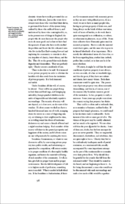
positioned on a page, separated by gutters and/or rules. Columns are most commonly used to break up large bodies of text that cannot fit in a single block of text on a page. Additionally, columns are used to improve page composition and readability. Newspapers very frequently use complex multi-column layouts to break up different stories and longer bodies of texts within a story. Column can also more generally refer to the vertical delineations created by a typographic grid system which type and image may be positioned.
Typographic style
For best legibility, typographic manuals suggest that columns should contain roughly 60 characters per line. One formula suggests multiplying the pointPoint (typography)
In typography, a point is the smallest unit of measure, being a subdivision of the larger pica. It is commonly abbreviated as pt. The point has long been the usual unit for measuring font size and leading and other minute items on a printed page....
size of the font by 2 to reach how wide a column should be in picas — in effect a column width of 24 em
Em (typography)
An em is a unit of measurement in the field of typography, equal to the currently specified point size.The name of em is related to M. Originally the unit was derived from the width of the capital "M" in the given typeface....
s. Following these guidelines usually results in multiple narrow columns being favored over a single wide column. Historically, books containing predominantly text generally have around 40 lines per column. However, this rule of thumb does not apply to more complex text that contain multiple images or illustrations, footnotes, running heads, folios, and captions.
Column contrast refers to the overall color or greyness established by the column, and can be adjusted in a number of ways. One way is to adjust the relationship between the width and height of the column. Another way is to make adjustments to the typeface
Typeface
In typography, a typeface is the artistic representation or interpretation of characters; it is the way the type looks. Each type is designed and there are thousands of different typefaces in existence, with new ones being developed constantly....
, from choosing a specific font, to adjusting weight, style, size and leading
Leading
In typography, leading refers to the distance between the baselines of successive lines of type. The term originated in the days of hand-typesetting, when thin strips of lead were inserted into the formes to increase the vertical distance between lines of type...
. Column contrast can be used to establish hierarchy, to balance the page composition, and to visually activate areas of the page.
Web layout
In web designWeb design
Web design is the process of planning and creating a website. Text, images, digital media and interactive elements are used by web designers to produce the page seen on the web browser...
, columns are often used to separate primary content from secondary and tertiary content. For example, a common two column layout may include a left column with navigation links, and a right column for body text. One method of creating columns for the web is to place text within an HTML
HTML
HyperText Markup Language is the predominant markup language for web pages. HTML elements are the basic building-blocks of webpages....
table element, often with the border set to zero. However, this method is considered outdated and inaccessible to some. Another method includes using CSS
Cascading Style Sheets
Cascading Style Sheets is a style sheet language used to describe the presentation semantics of a document written in a markup language...
to either float or position the corresponding text. These methods were not as straightforward as using HTML tables, which made a tableless three column layout a sort of holy grail once these techniques were discovered in the early 2000s. More recent levels of CSS have addressed column behaviors, although not many browsers support these behaviors.

