.gif)
Fraktur (typeface)
Encyclopedia

Blackletter
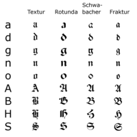
Blackletter, also known as Gothic script, Gothic minuscule, or Textura, was a script used throughout Western Europe from approximately 1150 to well into the 17th century. It continued to be used for the German language until the 20th century. Fraktur is a notable script of this type, and sometimes...
typeface
Typeface
In typography, a typeface is the artistic representation or interpretation of characters; it is the way the type looks. Each type is designed and there are thousands of different typefaces in existence, with new ones being developed constantly....
s derived from this hand. The word derives from the past participle fractus (“broken”) of Latin frangere (“to break”). As opposed to Antiqua (common) typefaces, which were modeled after antique Roman square capitals
Roman square capitals
Roman square capitals, also called capitalis monumentalis, inscriptional capitals, elegant capitals and quadrata, are an ancient Roman form of writing, and the basis for modern capital letters....
and Carolingian minuscule
Carolingian minuscule
Carolingian or Caroline minuscule is a script developed as a writing standard in Europe so that the Roman alphabet could be easily recognized by the literate class from one region to another. It was used in Charlemagne's empire between approximately 800 and 1200...
, the blackletter lines are broken up — that is, their forms contain many angles, in contrast to the smooth curves of Antiqua.
The term "Fraktur" is sometimes applied to all of the blackletter typefaces (known in German
German language
German is a West Germanic language, related to and classified alongside English and Dutch. With an estimated 90 – 98 million native speakers, German is one of the world's major languages and is the most widely-spoken first language in the European Union....
as Gebrochene Schrift).
Characteristics
Besides the 26 letters of the Latin alphabet, and the ßß
In the German alphabet, ß is a letter that originated as a ligature of ss or sz. Like double "s", it is pronounced as an , but in standard spelling, it is only used after long vowels and diphthongs, while ss is used after short vowels...
(Eszett
ß
In the German alphabet, ß is a letter that originated as a ligature of ss or sz. Like double "s", it is pronounced as an , but in standard spelling, it is only used after long vowels and diphthongs, while ss is used after short vowels...
ɛsˈtsɛt) and vowels with umlauts
Umlaut (diacritic)
The diaeresis and the umlaut are diacritics that consist of two dots placed over a letter, most commonly a vowel. When that letter is an i or a j, the diacritic replaces the tittle: ï....
as well, Fraktur typefaces include the ſ
Long s
The long, medial or descending s is a form of the minuscule letter s formerly used where s occurred in the middle or at the beginning of a word, for example "ſinfulneſs" . The modern letterform was called the terminal, round, or short s.-History:The long s is derived from the old Roman cursive...
(long s
Long s
The long, medial or descending s is a form of the minuscule letter s formerly used where s occurred in the middle or at the beginning of a word, for example "ſinfulneſs" . The modern letterform was called the terminal, round, or short s.-History:The long s is derived from the old Roman cursive...
), sometimes a variant form of the letter r, the r rotunda
R rotunda
The r rotunda , "rounded r," is an old letter variant found in full script-like typefaces, especially blackletters. Between the Middle Ages and today, many ways of writing alphabetical characters were lost. Besides a variety of ligatures, conjoined letters, scribal abbreviations, swash characters,...
, and a variety of ligature
Ligature (typography)
In writing and typography, a ligature occurs where two or more graphemes are joined as a single glyph. Ligatures usually replace consecutive characters sharing common components and are part of a more general class of glyphs called "contextual forms", where the specific shape of a letter depends on...
s once intended to aid the typesetter and which have specialized rules for their use. Most older Fraktur typefaces make no distinction between the majuscules "I" and "J" (where the common shape is more suggestive of a "J"), even though the minuscules "i" and "j" are differentiated.
One difference between the Fraktur and other blackletter scripts is that in the small-letter o, the left part of the bow is broken, but the right part is not.
Origin
The first Fraktur typeface was designed when Holy Roman EmperorHoly Roman Emperor
The Holy Roman Emperor is a term used by historians to denote a medieval ruler who, as German King, had also received the title of "Emperor of the Romans" from the Pope...
Maximilian I
Maximilian I, Holy Roman Emperor
Maximilian I , the son of Frederick III, Holy Roman Emperor and Eleanor of Portugal, was King of the Romans from 1486 and Holy Roman Emperor from 1493 until his death, though he was never in fact crowned by the Pope, the journey to Rome always being too risky...
(c. 1493–1519) established a series of books and had a new typeface created specifically for this purpose, designed by Hieronymus Andreae
Hieronymus Andreae
Hieronymus Andreae, or Andreä, or Hieronymus Formschneider, was a German woodblock cutter , printer, publisher and typographer closely associated with Albrecht Dürer...
. Fraktur quickly overtook the earlier Schwabacher
Schwabacher
The German word Schwabacher refers to a specific blackletter typeface. The term derives from the town of Schwabach.-Characteristics:The small-letter g and the capital-letter H have particularly distinctive forms.-History:...
and Textualis typefaces in popularity, and a wide variety of Fraktur fonts were carved.
Use
Typesetting in Fraktur was still very common in the early 20th century in all German-speakingGerman language
German is a West Germanic language, related to and classified alongside English and Dutch. With an estimated 90 – 98 million native speakers, German is one of the world's major languages and is the most widely-spoken first language in the European Union....
countries and areas, as well as in Norway
Norway
Norway , officially the Kingdom of Norway, is a Nordic unitary constitutional monarchy whose territory comprises the western portion of the Scandinavian Peninsula, Jan Mayen, and the Arctic archipelago of Svalbard and Bouvet Island. Norway has a total area of and a population of about 4.9 million...
, Estonia
Estonia
Estonia , officially the Republic of Estonia , is a state in the Baltic region of Northern Europe. It is bordered to the north by the Gulf of Finland, to the west by the Baltic Sea, to the south by Latvia , and to the east by Lake Peipsi and the Russian Federation . Across the Baltic Sea lies...
, and Latvia
Latvia
Latvia , officially the Republic of Latvia , is a country in the Baltic region of Northern Europe. It is bordered to the north by Estonia , to the south by Lithuania , to the east by the Russian Federation , to the southeast by Belarus and shares maritime borders to the west with Sweden...
, and was still used to a very small extent in Sweden
Sweden
Sweden , officially the Kingdom of Sweden , is a Nordic country on the Scandinavian Peninsula in Northern Europe. Sweden borders with Norway and Finland and is connected to Denmark by a bridge-tunnel across the Öresund....
, Finland
Finland
Finland , officially the Republic of Finland, is a Nordic country situated in the Fennoscandian region of Northern Europe. It is bordered by Sweden in the west, Norway in the north and Russia in the east, while Estonia lies to its south across the Gulf of Finland.Around 5.4 million people reside...
and Denmark
Denmark
Denmark is a Scandinavian country in Northern Europe. The countries of Denmark and Greenland, as well as the Faroe Islands, constitute the Kingdom of Denmark . It is the southernmost of the Nordic countries, southwest of Sweden and south of Norway, and bordered to the south by Germany. Denmark...
, while other countries typeset in Antiqua in the early 20th century. Some books at that time used related blackletter fonts such as Schwabacher
Schwabacher
The German word Schwabacher refers to a specific blackletter typeface. The term derives from the town of Schwabach.-Characteristics:The small-letter g and the capital-letter H have particularly distinctive forms.-History:...
; however, the predominant typeface was the Normalfraktur (Fig. 1), which came in slight variations.
.jpg)
Martin Bormann
Martin Ludwig Bormann was a prominent Nazi official. He became head of the Party Chancellery and private secretary to Adolf Hitler...
issued a circular to all public offices which declared Fraktur (and its corollary, the Sütterlin
Sütterlin
Sütterlinschrift , or Sütterlin for short, is the last widely used form of the old German blackletter handwriting . In Germany, the old German cursive script developed in the 16th century, replacing the Gothic handwriting at the same time that bookletters developed into the Fraktur typeface...
-based handwriting) to be Judenlettern (Jewish letters) and prohibited their further use. It has been speculated by German historian Albert Kapr that the régime had realized that Fraktur would inhibit communication in the territories occupied during World War II
World War II
World War II, or the Second World War , was a global conflict lasting from 1939 to 1945, involving most of the world's nations—including all of the great powers—eventually forming two opposing military alliances: the Allies and the Axis...
. Fraktur saw a short resurgence after the War, but quickly disappeared in a Germany keen on modernising its appearance.
Fraktur is today used mostly for decorative typesetting; for example, a number of traditional German newspapers such as the Frankfurter Allgemeine, as well as the Norwegian Aftenposten
Aftenposten
Aftenposten is Norway's largest newspaper. It retook this position in 2010, taking it from the tabloid Verdens Gang which had been the largest newspaper for several decades. It is based in Oslo. The morning edition, which is distributed across all of Norway, had a circulation of 250,179 in 2007...
, still print their name in Fraktur on the masthead
Nameplate (publishing)
In publishing, a nameplate is the title of a newspaper or other periodical in the type style and treatment in which it appears on the front page or cover of the periodical...
, and it is also popular for pub signs and the like. In this modern decorative use, the Fraktur rules about the use of long s
Long s
The long, medial or descending s is a form of the minuscule letter s formerly used where s occurred in the middle or at the beginning of a word, for example "ſinfulneſs" . The modern letterform was called the terminal, round, or short s.-History:The long s is derived from the old Roman cursive...
and short s and of ligature
Ligature (typography)
In writing and typography, a ligature occurs where two or more graphemes are joined as a single glyph. Ligatures usually replace consecutive characters sharing common components and are part of a more general class of glyphs called "contextual forms", where the specific shape of a letter depends on...
s are often disregarded.
Individual Fraktur letters appear frequently in mathematics
Mathematics
Mathematics is the study of quantity, space, structure, and change. Mathematicians seek out patterns and formulate new conjectures. Mathematicians resolve the truth or falsity of conjectures by mathematical proofs, which are arguments sufficient to convince other mathematicians of their validity...
, which often denotes associated or parallel concepts by a single letter in various fonts. For example, a Lie group
Lie group
In mathematics, a Lie group is a group which is also a differentiable manifold, with the property that the group operations are compatible with the smooth structure...
is often denoted by G, while its associated Lie algebra
Lie algebra
In mathematics, a Lie algebra is an algebraic structure whose main use is in studying geometric objects such as Lie groups and differentiable manifolds. Lie algebras were introduced to study the concept of infinitesimal transformations. The term "Lie algebra" was introduced by Hermann Weyl in the...
is
 . A ring ideal might be named
  while an element is
  .
.Fraktur in Unicode
In UnicodeUnicode
Unicode is a computing industry standard for the consistent encoding, representation and handling of text expressed in most of the world's writing systems...
, Fraktur is considered a font of the Latin script, and is not encoded separately. The additional ligatures that are required for fraktur fonts will not be encoded in Unicode.http://www.unicode.org/faq/ligature_digraph.html#7 Instead, Unicode proposes to deal with these ligatures using smart-font technologies such as OpenType
OpenType
OpenType is a format for scalable computer fonts. It was built on its predecessor TrueType, retaining TrueType's basic structure and adding many intricate data structures for prescribing typographic behavior...
, AAT
Apple Advanced Typography
Apple Advanced Typography is Apple Inc's computer software for advanced font rendering, supporting internationalization and complex features for typographers, a successor to Apple's little-used QuickDraw GX font technology of the mid-1990s...
or Graphite
Graphite (SIL)
Graphite is a programmable Unicode-compliant smart-font technology and rendering system developed by SIL International. It is free software, distributed under the terms of the GNU Lesser General Public License and the Common Public License....
. There are many fraktur fonts that do not use smart-font technologies but use their own legacy encoding instead that is not compliant with Unicode.
There are Fraktur symbols in the Unicode block
Unicode block
In Unicode, a block is defined as one contiguous range of code points. Blocks are named uniquely and have no overlap. They may be defined with the starting and ending code points. The block explicitly can include code points that are unassigned and non-characters. Code points not belonging to any...
s of mathematical alphanumeric symbols
Mathematical alphanumeric symbols
Mathematical Alphanumeric Symbols is a Unicode block of Latin and Greek letters and decimal digits that enable mathematicians to denote different notions with different letter styles .Unicode now includes many such symbols Mathematical Alphanumeric Symbols is a Unicode block of Latin and Greek...
and letterlike symbols. However, these are only meant to be used in mathematics.http://www.unicode.org/faq/ligature_digraph.html#8 Therefore, there are no letters such as ä, ö, ü, ß that are not used in mathematics.
Samples
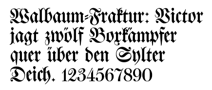
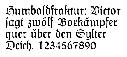
In these figures, the German sentence that appears after the names of the fonts (Walbaum-Fraktur in Fig. 1 and Humboldfraktur in Fig. 2) reads, "Victor jagt zwölf Boxkämpfer quer über den Sylter Deich". It means "Victor chases twelve boxers across the SyltSylt
Sylt is an island in northern Germany, part of Nordfriesland district, Schleswig-Holstein, and well known for the distinctive shape of its shoreline. It belongs to the North Frisian Islands and is the largest island in North Frisia...
dike" and contains all 26 letters of the alphabet plus the umlauted glyphs
Umlaut (diacritic)
The diaeresis and the umlaut are diacritics that consist of two dots placed over a letter, most commonly a vowel. When that letter is an i or a j, the diacritic replaces the tittle: ï....
used in German, making it an example of a pangram
Pangram
A pangram , or holoalphabetic sentence, is a sentence using every letter of the alphabet at least once. Pangrams have been used to display typefaces, test equipment, and develop skills in handwriting, calligraphy, and keyboarding...
. Note that in the second specimen, the "t" in "Humboldt" is omitted.


See also
|
Gaelic script Gaelic type, sometimes called Irish character, Irish type, or Gaelic script, is a family of insular typefaces devised for printing Irish and used between the 16th and 20th centuries. Sometimes all Gaelic typefaces are called Celtic or uncial, though most Gaelic types are not uncials... Kurrent Kurrent is an old form of German language handwriting based on late medieval cursive writing, also known as Kurrentschrift or Alte Deutsche Schrift... handwriting Long s The long, medial or descending s is a form of the minuscule letter s formerly used where s occurred in the middle or at the beginning of a word, for example "ſinfulneſs" . The modern letterform was called the terminal, round, or short s.-History:The long s is derived from the old Roman cursive... Morgenbladet Morgenbladet is a Norwegian weekly newspaper. It was founded in 1819 by the book printer Niels Wulfsberg, and was the country's first daily newspaper. For a long time, it was also the country's biggest newspaper. It was closed down by the German Wehrmacht during World War II... Sütterlin Sütterlinschrift , or Sütterlin for short, is the last widely used form of the old German blackletter handwriting . In Germany, the old German cursive script developed in the 16th century, replacing the Gothic handwriting at the same time that bookletters developed into the Fraktur typeface... handwriting |
Further reading
- Bain, Peter and Paul Shaw. Blackletter: Type and National Identity. Princeton Architectural Press: 1998. ISBN 1-56898-125-2.
- Silvia Hartmann: Fraktur oder Antiqua. Der Schriftstreit von 1881 bis 1941, Peter Lang, Frankfurt am Main u. a. 1998 (2. üb. A. 1999), ISBN 978-3-631-35090-4
- Fiedl, Frederich, Nicholas Ott and Bernard Stein. Typography: An Encyclopedic Survey of Type Design and Techniques Through History. Black Dog & Leventhal: 1998. ISBN 1-57912-023-7.
- Macmillan, Neil. An A–Z of Type Designers. Yale University PressYale University PressYale University Press is a book publisher founded in 1908 by George Parmly Day. It became an official department of Yale University in 1961, but remains financially and operationally autonomous....
: 2006. ISBN 0-300-11151-7.
External links
- A complete Fraktur chart Website of Dieter Steffmann, which has a large number of digitized Fraktur fonts
- Blackletter: Type and National Identity Delbanco: German Purveyors of Fraktur fonts (commercial)
- Setting up Microsoft Windows NT, 2000 or Windows XP to support Unicode supplementary characters
- UniFraktur: Free UnicodeUnicodeUnicode is a computing industry standard for the consistent encoding, representation and handling of text expressed in most of the world's writing systems...
-compliant Fraktur fonts and resources

